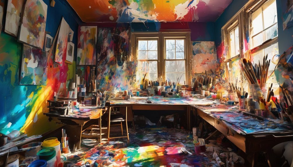
When coloring, you might not realize how easily you can fall into common traps that hinder your creative flow. From using subpar materials to neglecting the color wheel, these mistakes can dull your artistic expression. You may think rushing through a piece will save time, but it often leads to dissatisfaction. Understanding these pitfalls is essential to enhance your skills. What are the key mistakes you should be aware of?
Key Takeaways
- Using low-quality materials can result in uneven application and disappointing results; invest in better tools for a more satisfying coloring experience.
- Ignoring the color wheel leads to clashing hues; familiarize yourself with color relationships for harmonious artwork.
- Failing to consider lighting can alter color perception; test colors in different lighting conditions to ensure desired effects.
- Rushing through the coloring process often results in mistakes; take your time and enjoy the creative journey for better outcomes.
- Neglecting to practice regularly hinders skill development; consistent practice refines your technique and helps establish a unique style.
Ignoring the Importance of Quality Materials
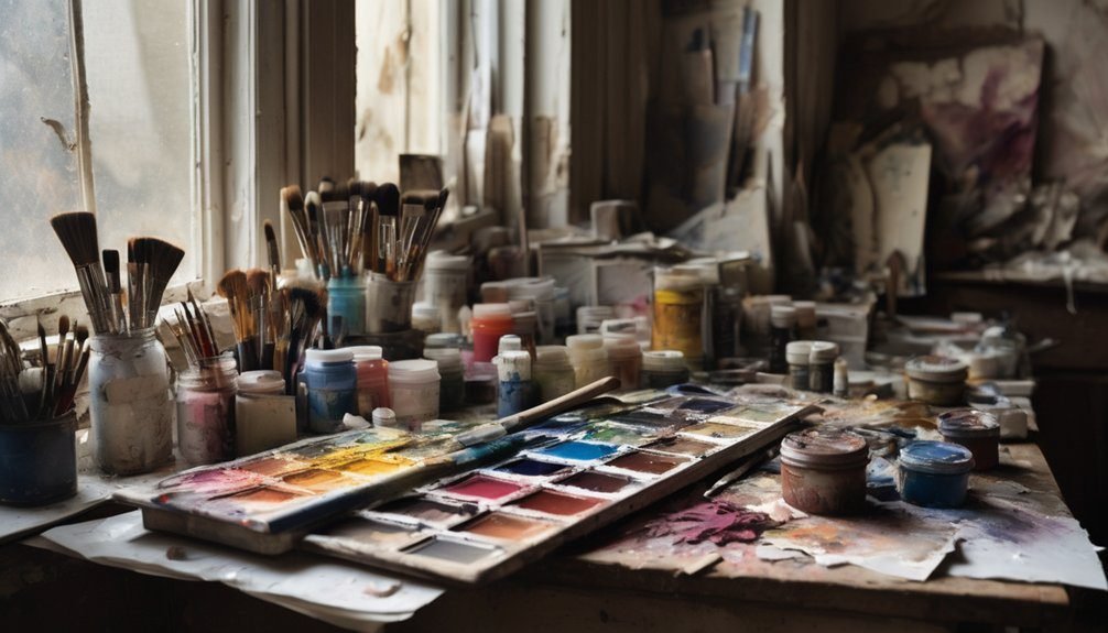
When you dive into coloring, you might overlook the significance of using quality materials, but doing so can drastically affect your results. Cheap crayons or markers can lead to uneven color application and frustration.
Instead, opt for higher-quality tools like professional-grade colored pencils or markers. These materials often blend better, providing smoother transitions and more vibrant colors. You’ll notice how much easier it’s to create depth and detail when you’re using the right supplies.
Choose professional-grade colored pencils or markers for vibrant colors and smoother transitions, making it easier to add depth and detail.
Plus, good paper can prevent bleeding and tearing, ensuring your artwork stands out. Investing in quality materials not only enhances your coloring experience but also boosts your overall satisfaction with your finished piece.
Don’t underestimate how much difference the right tools can make!

Skipping the Color Wheel
Many artists underestimate the value of the color wheel, but skipping it can lead to uninspired choices and clashing hues. This essential tool helps you understand color relationships, making it easier to create harmonious compositions. By familiarizing yourself with primary, secondary, and tertiary colors, you can mix and match hues effectively.
When you ignore the color wheel, you risk choosing colors that don’t complement each other, resulting in a disjointed artwork. Instead, take a moment to explore complementary, analogous, and triadic color schemes.
These concepts can elevate your color choices and enhance your overall impact. So, don’t overlook this vital resource—embracing the color wheel can transform your work and ignite your creativity.
Overlooking Lighting and Environment
Ignoring the impact of lighting and environment can derail your color choices just as easily as bypassing the color wheel.
Colors can look drastically different under natural light compared to artificial lighting. When you’re choosing a shade, consider how sunlight or incandescent bulbs will affect your colors throughout the day.
Take note of the surrounding elements in the space—walls, furniture, and decor can all influence how a color appears. If your room has dark furniture, lighter colors might pop more than you expect.
Also, pay attention to the colors of the room’s fixtures and accessories; they can clash or complement your choices. By factoring in your environment, you can ensure your colors truly shine in their intended light.
Failing to Test Colors Before Applying
Before committing to a color, it’s essential to test it on your walls, as what looks good in a small swatch can drastically change when applied to a larger surface. You might find that a vibrant shade appears overwhelming or a muted tone feels too dull once it envelops the entire room.
Here’s a quick reference table to help you decide:
| Testing Method | Benefits |
|---|---|
| Paint Samples | See color in context |
| Foam Boards | Move around the room |
| Digital Apps | Visualize multiple options |
Neglecting to Layer and Blend
While it might seem easier to apply a single coat of paint, neglecting to layer and blend can lead to a flat and uninviting look.
To achieve depth and dimension, you should focus on building up layers gradually. Start with a base color and then add additional shades to create highlights and shadows. This approach not only enhances the overall appearance but also allows for more creativity in your work.
Remember to blend the colors seamlessly; it’s the key to achieving that smooth transition that brings your piece to life. Don’t rush the process—take your time to experiment with different techniques.
With practice, you’ll discover how layering and blending can transform your coloring from ordinary to extraordinary.
Using Too Much Pressure on the Coloring Tool
When you apply too much pressure on your coloring tool, you risk damaging the surface of your paper and compromising the quality of your work. Overly aggressive pressure can create unwanted indentations or tears, making your artwork look less polished.
It can also lead to uneven color application, which detracts from the overall aesthetic. Instead, try to use a light touch and gradually build up color. This approach not only improves the final look but also allows for better control over shading and blending.
If you find yourself pressing too hard, take a moment to relax your grip. Remember, coloring is about enjoying the process, so give yourself the freedom to experiment without the fear of ruining your paper.
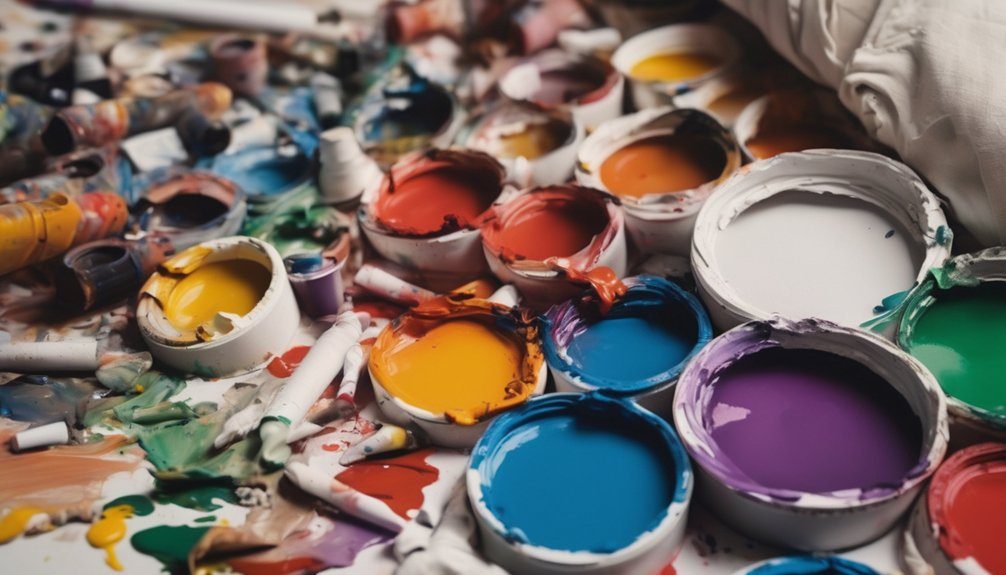
Not Planning the Color Palette
Failing to plan your color palette can lead to a chaotic and unappealing final piece. When you dive in without a clear scheme, you risk clashing colors that don’t complement each other. This can create visual disarray and detract from your work’s overall impact.
Before starting, take a moment to choose a harmonious set of colors that resonate with your theme. Think about the mood you want to convey—warm tones for energy or cool tones for calm. You don’t have to stick to a rigid plan, but having a basic palette in mind can guide your choices and keep your coloring balanced.
Forgetting to Take Breaks
As you immerse yourself in coloring, it’s easy to lose track of time and forget to take breaks. However, skipping these pauses can lead to mental fatigue and decreased creativity. Your hands might cramp, and your eyes may strain, making it harder to focus on the details you love.
Set a timer or use natural breaks in your day to step back for a moment. Stretch, hydrate, or simply gaze away from your work. These short pauses can refresh your mind and improve your overall experience.
Rushing the Process
Taking breaks is important, but don’t let that lead you to rush through your coloring project. When you hurry, you risk making mistakes that can ruin your artwork. Skipping steps or being careless with your colors can create harsh lines or uneven shading.
Instead of focusing on the end result, enjoy the process and take your time. This allows you to be more mindful about your choices and appreciate your creativity. Remember, it’s not a race. Set realistic goals for each session, and give yourself the freedom to explore different techniques.
Disregarding the Importance of Practice
While it might be tempting to dive straight into complex projects, neglecting the importance of practice can hinder your growth as an artist. Regular practice helps you refine your skills, understand color theory, and develop your unique style. Instead of jumping into intricate designs, focus on simple exercises to build your confidence.
Here’s a quick table to help you visualize the benefits of practice:
| Practice Type | Benefits | Suggested Time |
|---|---|---|
| Color Mixing | Improves color understanding | 10 minutes daily |
| Simple Shapes | Enhances control and precision | 15 minutes daily |
| Quick Sketches | Boosts creativity | 20 minutes daily |
Frequently Asked Questions
What Type of Paper Is Best for Coloring?
The best paper for coloring is heavyweight, smooth paper. It prevents bleed-through and allows for vibrant colors. You’ll enjoy how it holds different mediums, like markers, colored pencils, or watercolors, without warping or tearing.
How Can I Clean My Coloring Tools Effectively?
To clean your coloring tools effectively, rinse them under warm water, using gentle soap. Like a river washing away dirt, this keeps your tools vibrant and ready, ensuring your creativity flows smoothly for every masterpiece.
What Are Some Good Color Combinations for Beginners?
For beginners, try pairing blue and yellow for a fresh look, or red and green for a classic contrast. Don’t forget to experiment with pastels and neutrals to create balanced, harmonious palettes that pop!
How Often Should I Change My Coloring Techniques?
You shouldn’t change your techniques too often; that’d be too easy, right? Instead, stick with what you know, but don’t be afraid to experiment occasionally. Finding your style takes time, so enjoy the process!
Can I Use Digital Tools for Traditional Coloring Styles?
Absolutely, you can use digital tools to mimic traditional coloring styles. Experiment with various brushes and textures, and don’t hesitate to blend techniques. It’ll enhance your creativity and give your artwork a unique flair.
Conclusion
In the world of coloring, don’t let your creativity be stifled by avoidable mistakes. Think of your materials as the sturdy canvas of your imagination; without quality, the masterpiece crumbles. Treat the color wheel like a trusted compass, guiding you toward harmony. Remember, coloring isn’t a race; it’s a dance that flourishes with patience and practice. So, take a step back, breathe, and let your colors flow like a gentle river, shaping your unique artistic journey.