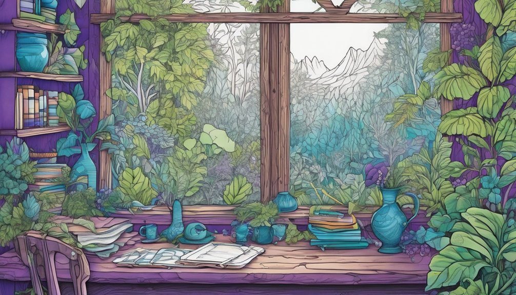
Creating depth in your coloring pages can elevate your artwork from flat to dynamic. By understanding the basics of shadows and highlights, you can add dimension to your pieces. Choosing the right colors and techniques is essential. Are you ready to explore the various methods that can transform your illustrations into vibrant, three-dimensional works of art? Let’s uncover the secrets together.
Key Takeaways
- Use perspective techniques by varying the size of objects to create a sense of distance in your coloring pages.
- Incorporate layering by overlapping elements to enhance the illusion of depth.
- Apply shadows by using darker shades of the base color to indicate the direction of light.
- Add highlights with lighter colors or white where light hits, creating a luminous effect.
- Experiment with color palettes, balancing warm and cool tones to convey depth and mood.
Understanding the Basics of Depth in Art
When you explore depth in art, you’ll discover that it isn’t just about colors and shapes but also about creating a sense of three-dimensional space on a two-dimensional surface.
To understand depth, you should first grasp the concepts of perspective, scale, and layering. Perspective helps you position objects based on their distance from the viewer, while scale allows you to depict sizes realistically.
Layering involves placing elements in front and behind one another, enhancing the illusion of depth. Use shadows and highlights to define forms, making them appear more dimensional.

Choosing the Right Color Palette
Choosing the right color palette can significantly enhance the depth and appeal of your coloring pages. Start by selecting colors that complement each other; this creates harmony and draws the eye.
Think about the mood you want to convey—warm colors like reds and oranges evoke energy, while cool colors like blues and greens offer calmness.
Consider the emotions you wish to express—vibrant warm tones inspire excitement, while soothing cool hues promote tranquility.
Experiment with analogous colors, which are next to each other on the color wheel, or use contrasting colors for a bolder effect.
Don’t forget to consider the balance of light and dark shades; adding variety in saturation and brightness can make your artwork pop.
Finally, trust your instincts; sometimes, the colors that speak to you’ll create the most engaging pages.
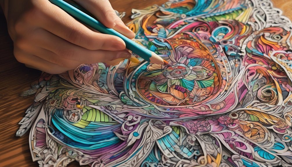
Techniques for Adding Shadows
To create depth in your coloring pages, you’ll want to master the art of adding shadows, as they can transform flat images into three-dimensional works of art.
Start by identifying your light source; this will guide where your shadows should fall. Use a darker shade of the base color for your shadows, applying it in areas that would naturally be less illuminated.
Blending can help create a smoother transition between colors, making the shadows appear more realistic. Don’t forget to vary the intensity of your shadows; areas farther from the light source should be darker.
Experiment with techniques like stippling or cross-hatching to add texture. With practice, you’ll enhance your coloring pages, making them pop off the page.
Highlighting for a Luminous Effect
While shadows add depth, highlights bring your coloring pages to life by creating a luminous effect. To achieve this, think about where your light source is. You’ll want to apply lighter colors or even white in areas that would catch light, like the edges of leaves, the tops of flowers, or shiny surfaces.
Use a gentle touch; you don’t want harsh lines, so blend your highlights smoothly with the base colors. Experiment with different mediums, too—gel pens or metallic markers can add that extra sparkle.
Don’t forget to consider the overall composition; strategic highlighting can draw attention to key elements and enhance the visual interest of your artwork. Your coloring pages will radiate vibrancy and energy!
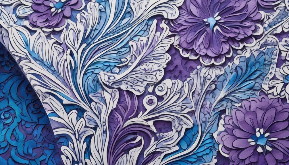
Layering Colors for Dimension
After enhancing your artwork with highlights, layering colors can take your coloring pages to new heights of dimension.
Start by selecting two or three shades of the same color family. Apply the lightest shade first, filling in the areas you want to stand out. Then, take the medium shade and blend it into the edges, creating a smooth transition.
Finally, use the darkest shade sparingly in the corners or shadowed areas to add depth. Don’t hesitate to go back and revisit layers; blending them well can create a stunning effect.
Experimenting With Textures
Textures can transform your coloring pages from flat to fabulously dynamic.
By incorporating different textures, you’ll breathe life into your artwork and engage your audience’s senses.
Experimenting with textures allows you to create a more immersive experience.
Here are three ideas to get you started:
- Faux Fur: Use a fine brush to mimic the softness of fur, adding warmth and coziness.
- Wood Grain: Create a rustic feel by layering lines and shading to resemble wood, evoking nostalgia and comfort.
- Metallic Sheen: Incorporate metallic colors to give your pages a vibrant, eye-catching glow, sparking excitement.
Tips for Practicing Depth in Your Art
To create depth in your coloring pages, it’s essential to understand how light and shadow interact with shapes and forms. Start by identifying your light source; this will guide where you apply highlights and shadows. Use darker shades to create shadows and lighter colors for highlights. Gradually blend your colors to achieve a smooth transition.
Here’s a simple table to help you practice:
| Technique | Description | Example |
|---|---|---|
| Layering | Apply colors in layers | Build depth in flowers |
| Contrast | Use light and dark colors | Enhance shapes |
| Blending | Smooth transitions between colors | Create soft edges |
| Highlighting | Add bright spots for realism | Shine on water droplets |
| Shadowing | Darken areas opposite light | Depth in landscapes |
Keep experimenting!
Frequently Asked Questions
What Materials Are Best for Coloring Pages?
For coloring pages, you’ll love colored pencils, markers, and gel pens. Each material offers unique vibrancy and blending options. Experiment with them to find what suits your style and enhances your creativity the best!
Can Digital Tools Enhance Depth in Coloring?
Absolutely! Digital tools can transform your coloring experience, adding layers and textures that make your artwork pop like a vibrant sunset. With shading and blending options, you’ll create stunning depth that captivates the eye.
How Do I Choose a Theme for Depth?
Choose a theme that resonates with you, like nature or fantasy. Consider contrasting elements, such as light and shadow, to create visual interest. Let your imagination guide you, and don’t be afraid to experiment!
Is There a Specific Order for Coloring Layers?
You don’t need a strict order, but start with lighter colors for the background, then layer darker shades in the foreground. Think of it like stacking pancakes; the bottom layers support the delicious top!
How Can I Fix Mistakes While Coloring?
You can fix mistakes while coloring by using an eraser for colored pencils, a correction fluid for markers, or adding darker shades to cover errors. Just be patient and blend carefully for a seamless look.
Conclusion
Incorporating depth into your coloring pages isn’t just about technique; it’s a journey of discovery. You might find that the more you practice layering, shadowing, and highlighting, the more your skills will evolve. Some believe that mastering these techniques can transform any flat image into a captivating masterpiece. So, why not experiment with your color palette and see if you can unlock a new dimension in your art? Dive in, and you might just surprise yourself!