When it comes to picking the perfect coloring palettes, understanding the fundamentals of color theory is crucial. You’ll want to explore various color harmonies and consider how contrast can elevate your designs. Think about the emotional impact of colors, too. Each choice you make can set a tone or convey a message. But how do you effectively combine these elements? Let’s explore the essential steps to create palettes that resonate.
Key Takeaways
- Understand color theory basics, including primary, secondary, and tertiary colors, to create well-balanced palettes.
- Utilize color harmonies, such as complementary and analogous schemes, for visually appealing combinations.
- Consider the emotional effects of colors to evoke the desired mood in your design.
- Leverage tools like color wheels and digital color pickers for easy palette creation and exploration.
- Test your color choices through mock-ups and gather feedback to refine your palette effectively.
Understanding Color Theory

When you dive into color theory, you’ll quickly realize it’s more than just mixing paints; it’s about understanding how colors interact and influence emotions. Each color carries its own psychological weight—red can evoke passion, while blue often brings calmness.
You’ll want to consider the color wheel, which helps you identify primary, secondary, and tertiary colors. Complementary colors, placed opposite each other, create dynamic contrasts, while analogous colors, next to each other, offer harmony.
Think about warm colors like yellows and oranges that energize, versus cool colors like greens and purples that soothe. By grasping these fundamentals, you can create palettes that not only look good but also convey the feelings and messages you want to express in your work.
Exploring Color Harmonies
Understanding how colors interact leads you to the concept of color harmonies, which are combinations that create visual balance and appeal.
When you explore these harmonies, you’ll find several key types, including complementary, analogous, and triadic schemes.

Complementary colors sit opposite each other on the color wheel, providing strong contrast and vibrancy.
Analogous colors, found next to each other, create a serene and cohesive look.
Triadic schemes involve three evenly spaced colors, offering a dynamic yet balanced palette.
As you experiment with these harmonies, consider the emotional impact of each combination.
Take time to test your selections in different contexts, ensuring they evoke the desired mood and enhance your overall design.
Your choices can transform your project into a captivating visual experience.
The Importance of Contrast
While color harmonies create a foundation for your design, contrast plays a crucial role in ensuring your work stands out. It helps draw attention to important elements and creates a visual hierarchy that guides the viewer’s eye.
When you use contrasting colors, you can highlight key features and make text more readable. Think about pairing light and dark shades or warm and cool tones to create that visual pop.
This contrast not only enhances aesthetics but also improves functionality by making your design more accessible. Remember, too much contrast can be jarring, so find a balance that complements your overall palette.
Emotional Effects of Colors
Colors don’t just serve aesthetic purposes; they evoke emotions and can influence the mood of your design.
Choosing the right colors can create the atmosphere you want, whether it’s calming or energizing.
Think about how certain colors resonate with people:
- Red: Energizes and evokes passion or urgency.
- Blue: Calms and instills a sense of trust and stability.
- Yellow: Sparks joy and creativity, but can be overwhelming in excess.
Seasonal and Trend-Based Palettes
When you consider the changing seasons, you’ll notice how they naturally inspire different color palettes that resonate with the mood and themes of each time of year.
Spring often bursts with pastels like soft pinks and greens, reflecting renewal and growth.
Spring radiates with pastel hues of gentle pinks and greens, symbolizing a season of renewal and vibrant growth.
Summer brings vibrant, saturated hues such as bright yellows and ocean blues, evoking warmth and energy.
Autumn introduces rich, earthy tones like deep oranges and browns, celebrating harvest and transition.
Winter, with its cool blues and whites, creates a serene and calm atmosphere.
Additionally, staying aware of current design trends can help you choose colors that feel fresh and relevant.
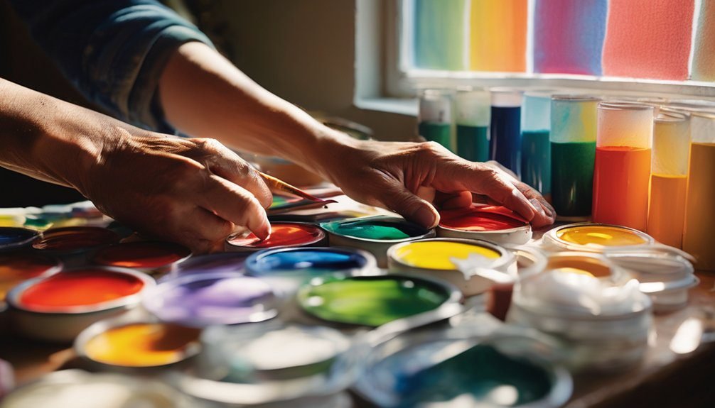
Tools for Color Selection
With the seasonal shifts inspiring your palette choices, it’s important to have the right tools at your disposal for selecting colors effectively.
A well-chosen color palette can elevate your projects and make them more visually appealing. Here are some essential tools to help you on your journey:
- Color Wheel: This classic tool helps you understand color relationships, making it easier to pick complementary or analogous colors.
- Digital Color Pickers: Apps like Adobe Color and Coolors allow you to experiment with colors easily and create harmonious palettes on the go.
- Swatch Books: Physical swatch books from paint companies give you a tangible way to see and feel colors, ensuring your selections resonate with your vision.
Equip yourself with these tools, and you’ll make color selection a breeze!
Testing Your Palette
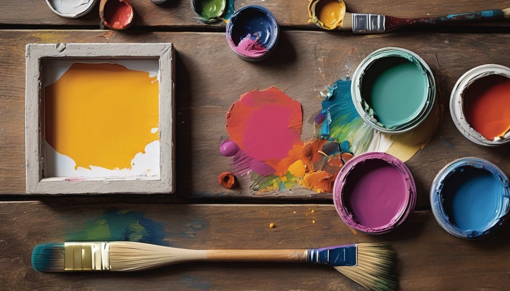
Before finalizing your color palette, it’s crucial to test how the colors work together in your specific context. Start by creating mock-ups or prototypes using your chosen colors. This gives you a visual representation of how they interact, helping you spot any clashes or inconsistencies.
Pay attention to how the colors feel when placed next to one another; do they create harmony or tension? You can also use digital tools to simulate your palette in different scenarios.
Don’t hesitate to gather feedback from peers or potential users, as their perspectives can provide valuable insights. Finally, consider how the colors appear under different lighting conditions, as this can significantly impact their perception.
Adjust your palette accordingly until you achieve the desired effect.
Adapting Palettes for Different Mediums
Testing your palette can reveal how colors work in a specific context, but it’s also important to adapt those colors for different mediums. Each medium—be it digital, watercolor, or acrylic—can alter how colors appear.
Here are some tips to help you adjust your palette:
- Digital Mediums: Colors often appear more vibrant on screens. Use softer hues to avoid overwhelming visuals.
- Watercolors: Transparency can lighten colors significantly. Test your shades on paper to see how they blend and dry.
- Acrylics: These can dry darker than they appear when wet. Mix your colors carefully to achieve the desired shade.
Adapting your palette ensures your artwork maintains its intended impact, regardless of the medium you choose.
Practical Examples and Case Studies
As you explore different coloring palettes, consider how real-world examples can inform your choices. Analyzing successful designs helps you understand the emotional impact of colors. For instance, brands like Airbnb use warm tones to create a welcoming feel, while tech companies often favor cooler shades for a sleek, modern look.
Here’s a table summarizing some effective palettes:
| Example | Color Scheme |
|---|---|
| Airbnb | Warm Reds, Soft Whites |
| Starbucks | Earthy Greens, Creamy Browns |
| Blue, White, Grey | |
| Gradient of Purple, Pink |
These case studies illustrate how color influences perception and can guide your palette selection for various projects.
Frequently Asked Questions
How Do Cultural Meanings of Colors Influence Palette Choices?
Cultural meanings of colors shape your palette choices by evoking emotions and associations. You’ll find that certain colors resonate differently depending on cultural backgrounds, helping you convey specific messages or themes effectively in your designs.
Can I Use More Than One Color Palette in a Project?
Absolutely, you can use multiple color palettes in a project! In fact, studies show that 78% of designers find diverse palettes enhance creativity. Mixing colors can create depth and intrigue, making your work more visually engaging.
What Are Common Mistakes to Avoid When Selecting Colors?
When selecting colors, avoid using too many bright hues, neglecting contrast, and ignoring the project’s mood. Don’t forget to test combinations together, as what looks good individually might clash when placed side by side.
How Do Lighting Conditions Affect Color Perception?
Lighting conditions dramatically affect color perception. Under different lights, colors can appear warmer or cooler, altering how you see them. Always test colors in the lighting of the space to get accurate results.
Is It Necessary to Stick to a Color Palette Strictly?
You don’t have to stick to a color palette strictly—think of an artist’s canvas. Flexibility can spark creativity, allowing you to experiment and discover unexpected combinations that enhance your work’s vibrancy and depth.
Conclusion
In summary, selecting stunning color schemes starts with savvy understanding. By blending bold basics with beautiful harmonies, you’ll create captivating combinations that resonate emotionally. Don’t forget to test and tweak your palettes for perfection! With the right tools and techniques, you can transform any project into a visual masterpiece. So, dive into the delightful world of color, and let your creativity shine through!