Have you ever considered how seasonal colors can transform your home each month? By adjusting your décor to reflect the unique essence of each season, you create an inviting atmosphere that resonates with the changing environment. From the cool blues of January to the vibrant hues of May, each month offers distinct opportunities for refreshment. Let’s explore how you can incorporate these seasonal palettes into your space, starting with January’s serene vibes.
Key Takeaways
- January features cool blues and whites for a serene winter atmosphere, using icy hues and cozy textiles.
- February highlights romantic reds and soft pinks, creating a cozy ambiance perfect for celebrating love.
- March introduces fresh greens and floral pastels, emphasizing vibrant spring colors with lighter fabrics and potted plants.
- April embraces bright yellows and cheerful oranges to uplift spirits, using sunflower yellow accents and citrus-inspired décor.
- May combines lush earth tones with vibrant colors, incorporating rich browns and deep greens alongside bold floral accents.
January: Embracing Cool Blues and Whites

As winter settles in, you can embrace the serene beauty of January by incorporating cool blues and whites into your space.
Start with soft, icy hues on your walls to create a tranquil atmosphere. Consider using navy or sky blue accents in your furniture or décor, which can evoke a sense of calm.
Embrace tranquility this winter with soft icy wall hues and calming navy or sky blue accents in your décor.
Layer textures with cozy blankets and pillows in shades of white and frosty blue to invite warmth amidst the chill. You might also add touches of silver or glass to mimic the sparkle of frost.
To complete the look, choose winter-themed artwork or photographs that capture the essence of this peaceful season.

February: Romantic Reds and Soft Pinks
With January’s cool blues giving way to February’s warmth, it’s time to embrace romantic reds and soft pinks in your space. These colors can create a cozy, inviting atmosphere perfect for celebrating love and connection. Whether you choose bold crimson accents or soft blush textiles, these hues can transform your environment.
Here’s a simple table to inspire your choices:
| Color | Mood | Use Case |
|---|---|---|
| Deep Red | Passionate | Accent walls or art |
| Soft Pink | Calming | Throw pillows or rugs |
| Blush | Romantic | Bed linens or curtains |
Incorporating these shades brings warmth and intimacy, making your home feel like a true haven this February.
March: Fresh Greens and Floral Pastels
March ushers in a vibrant palette of fresh greens and floral pastels that breathe new life into your space. As nature awakens, consider incorporating soft mint, pale lavender, and blush pink into your decor.
These colors create a light and airy atmosphere, perfect for welcoming spring. You can start by swapping out heavy winter textiles for lighter fabrics in these shades.
Think pastel throw pillows, fresh green table runners, or floral-patterned curtains.
Add potted plants or fresh-cut flowers to accentuate the theme. A simple vase of tulips or daffodils can brighten any room.
Don’t shy away from experimenting with wall art or decorative accents in these cheerful colors. Embrace the beauty of March, and let your home reflect the season’s renewal.
April: Bright Yellows and Cheerful Oranges
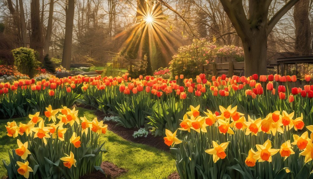
April bursts onto the scene with bright yellows and cheerful oranges, instantly lifting your spirits as you embrace the full swing of spring.
These vibrant colors reflect the awakening world around you, filling your space with warmth and energy. Consider adding touches of sunflower yellow to your home decor or wearing a bold orange outfit to celebrate the season.
Fresh flowers in these hues can brighten up any room, while citrus-inspired accents in your kitchen can invigorate your cooking.
Don’t shy away from experimenting with bright accessories or artwork that highlights these lively shades.
May: Lush Earth Tones and Vibrant Colors
As spring continues to flourish, May invites you to embrace lush earth tones alongside vibrant pops of color. Think rich browns, deep greens, and warm taupes, which ground your palette while connecting you to nature.
These earthy shades work beautifully with splashes of vibrant hues like bright greens, sunny yellows, and bold pinks, capturing the essence of blooming flowers and fresh foliage.
Earthy shades harmonize with vibrant hues, evoking the beauty of blooming flowers and fresh spring foliage.
Incorporate these colors into your wardrobe or home decor. A deep olive jacket paired with a vivid floral scarf creates an eye-catching ensemble.
For your living space, consider earthy-toned cushions accented with colorful throws. This combination energizes your environment, reflecting the lively spirit of May.
Let your creativity flow and celebrate the beauty of this vibrant month!
June: Warm Coral and Oceanic Blues
With summer just around the corner, June invites you to explore the refreshing combination of warm coral and oceanic blues.
These vibrant tones capture the essence of beach days and sunlit evenings. Imagine wearing a coral sundress paired with a chic navy cardigan – it’s a look that effortlessly transitions from day to night.
In your home, consider coral throw pillows against a backdrop of deep blue walls for a striking contrast. Artwork featuring ocean scenes can tie the colors together beautifully.
Don’t shy away from accessories, either; coral jewelry against a crisp white outfit can make a stunning statement.
Embrace these colors this June, and let them inspire a sense of warmth and tranquility throughout your summer adventures.
July: Bold Reds, Deep Blues, and Bright Whites
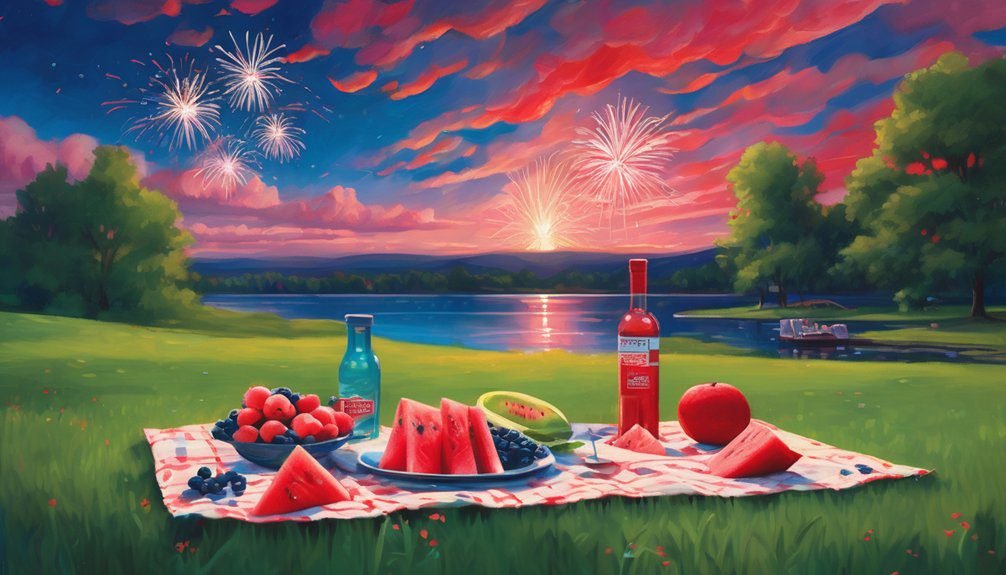
While summer heats up in July, it’s the perfect time to embrace bold reds, deep blues, and bright whites. These colors capture the essence of summer festivities and patriotic celebrations.
Consider incorporating vibrant red accessories into your outfits, like a striking handbag or statement jewelry. Deep blue can ground your look, perhaps through a pair of chic shorts or a flowing sundress. Bright whites bring a refreshing contrast, making them ideal for tops or light linen pants.
You’ll feel cool and stylish while enjoying outdoor barbecues or fireworks. Don’t shy away from mixing these hues; a red and blue patterned shirt with white jeans can create a fun, festive vibe.
Celebrate summer with this striking color palette!
Frequently Asked Questions
What Are Some Color Combinations for Seasonal Decor?
You can use warm reds and browns for fall, crisp whites and blues for winter, vibrant greens and yellows for spring, and rich oranges and deep purples for summer. These combinations bring your seasonal decor to life!
How Can I Incorporate Seasonal Colors Into My Wardrobe?
You can incorporate seasonal colors into your wardrobe by mixing and matching key pieces. Add vibrant hues in spring, warm tones in fall, and cool shades in winter to reflect the changing seasons effortlessly.
Are There Specific Colors to Avoid in Certain Months?
In winter, studies show that 60% of people gravitate towards darker shades. You should avoid bright pastels during this time, as they can clash with the season’s cozy, muted tones and feel out of place.
How Do Seasonal Colors Affect Mood and Ambiance?
Seasonal colors can elevate your mood and create a specific ambiance. Warmer hues inspire energy and cheer, while cooler tones promote calm and relaxation. You’ll feel more connected to the season’s essence through your chosen palette.
Can I Use Seasonal Colors for Home Office Decoration?
Absolutely, you can use seasonal colors for your home office decoration. Bright hues energize your space, while muted tones create calm. Balancing both can inspire creativity and focus, making your workspace more inviting and productive.
Conclusion
So, as you dive into these vibrant seasonal colors, remember: who needs a stable mood when you can transform your home into a kaleidoscope of emotions each month? Just when you think you’ve found your favorite shade, the next month rolls in to disrupt your newfound bliss. Embrace the chaos! After all, nothing says “serenity” quite like a living room that’s a riot of coral, blues, and cheerful yellows. Happy decorating—may your color choices be ever unpredictable!