As an artist, you often find inspiration in unexpected places. The vibrant colors of a sunrise or the muted tones of a rainy day can ignite your creativity. Nature’s palette offers endless possibilities, while cultural influences shape your perception of color. By exploring these sources, you can enhance your work with emotional depth and resonance. But how do you translate these inspirations into your own unique palette? Let’s explore the nuances that guide your choices.
Key Takeaways
- Explore nature’s vibrant colors, from wildflower fields to autumn leaves, to ignite your creativity and inspire your artwork.
- Study cultural influences on color choices, such as Japanese serenity or Indian festival vibrancy, to enrich your color palette.
- Utilize the color wheel to understand relationships between colors and create harmonious, balanced compositions in your art.
- Experiment with warm and cool tones to evoke specific moods and emotions, enhancing the overall impact of your artwork.
- Personalize your color choices by incorporating meaningful experiences and reflecting your unique style and aesthetic in your decor.
Nature’s Palette: Finding Colors in the Great Outdoors
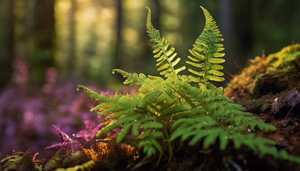
Nature offers a stunning array of colors that can ignite your creativity and inspire your artwork. Imagine wandering through fields of wildflower hues, where vibrant yellows, purples, and reds dance in the breeze.
As you trek deeper into the woods, forest greens envelop you, creating a calming backdrop for your imagination. Explore the desert, where muted desert tones blend seamlessly with the golden sands under a blazing sun.
The ocean offers soothing shades of blue and turquoise, mirroring the vastness of your thoughts. Don’t forget the fiery palette of autumn leaves, showcasing seasonal shifts that signal change.
Capture the breathtaking sunrise colors and the majestic mountain vistas that surround you, each inspiring various artistic expressions waiting to be brought to life.
Art History: Learning From Masters
As you delve into the world of art history, you’ll discover a treasure trove of techniques and styles that have shaped the art we admire today.

By studying the masters, you can uncover masterful techniques like chiaroscuro from Caravaggio, which brings depth and drama to your work.
Explore Impressionism‘s loose brushwork and vibrant color palettes, allowing you to capture light in unique ways.
Each artistic style offers insights into composition, color application, and emotional expression.
By analyzing these great works, you can identify what resonates with you and adapt those elements in your own creations.
Learning from the past not only enriches your artistic toolbox but also inspires your own journey in the vibrant world of color and creativity.
Color Theory Basics: Understanding the Wheel

To truly harness the power of color in your artwork, understanding the color wheel is essential. This circular tool organizes colors into primary, secondary, and tertiary categories, allowing you to visualize relationships between hues.
By grasping color harmony, you’ll create more balanced and appealing compositions. For instance, complementary colors—those opposite each other on the wheel—generate striking contrasts that can make your artwork pop.
Imagine pairing vibrant blue with fiery orange; the result is eye-catching and dynamic. By experimenting with these color relationships, you can evoke emotions and set the mood in your pieces.
As you explore the wheel, let it guide your choices, enriching your artistic journey with newfound vibrancy and depth.
Cultural Influences: Exploring Global Color Schemes
The influence of culture on color choices in art can’t be overstated. When you explore Japanese aesthetics, you’ll notice serene palettes that evoke tranquility.
African textiles burst with vibrant hues, celebrating life and community. Think about the vivid colors of Indian festivals, where every shade tells a story.
Vibrant colors in African textiles and Indian festivals embody the essence of life, community, and storytelling.
Mediterranean landscapes inspire earthy tones that reflect sun-drenched vistas. South American art showcases bold contrasts, while Native American motifs often incorporate nature’s colors, symbolizing harmony.
Scandinavian design favors minimalism, using soft, muted shades. Asian architecture employs color to convey balance and serenity, while intricate Middle Eastern patterns play with rich, jewel tones.
Finally, Caribbean colors radiate warmth and joy, inviting you to immerse yourself in a cultural tapestry of inspiration.
Digital Tools: Using Apps for Color Inspiration
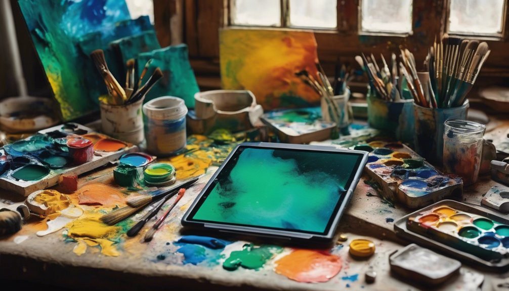
How can digital tools enhance your color exploration in art? With color picking apps at your fingertips, you can dive into a world of vibrant possibilities.
These apps often boast features like customizable color palettes and inspiration boards that spark creativity. Imagine using digital brushes to experiment with colors in real-time, allowing you to see how hues interact on your canvas.
The user experience is designed for ease, making it simple to create harmonious combinations or bold contrasts. You can save your favorite palettes and access them anytime, ensuring a steady flow of inspiration.
Embrace these digital tools and watch as they transform your artistic process, providing endless opportunities for color experimentation.
Mood and Emotion: Choosing Colors to Convey Feelings
While you explore the world of color, understanding how different hues influence mood and emotion can elevate your artwork to new heights.
Emotion psychology reveals that colors carry symbolism and associations that resonate deeply. For instance, warm tones like reds and oranges can evoke passion and energy, while cool blues and greens often promote calmness and serenity.
By employing color contrast effectively, you enhance visual storytelling, guiding your audience’s emotional journey. Consider how color perception varies among viewers; what feels vibrant to one might seem overwhelming to another.
Use these insights to create emotional resonance in your pieces. Ultimately, the right palette can serve as a powerful tool for mood enhancement, allowing you to convey feelings and connect with your audience profoundly.
Everyday Life: Drawing Inspiration From Daily Surroundings
Look around you; your everyday surroundings are a treasure trove of color inspiration waiting to be explored.
Whether it’s the vibrant hues of nature, the dynamic energy of urban scenes, or the cozy palettes of home decor, each element offers a unique perspective that can ignite your creativity.
Nature’s Color Palette
Nature’s color palette is a vibrant tapestry that unfolds around you, offering endless inspiration for artists. As you wander through the woods, notice the rich forest hues—deep greens, sunlit yellows, and earthy browns blending harmoniously.
These colors evoke a sense of tranquility and connection to the Earth. Meanwhile, a stroll by the shore reveals the soothing ocean tones, where shades of azure and turquoise swirl with sandy beiges, creating a serene atmosphere.
Pay attention to how these colors interact with light and shadow, transforming with the time of day. By observing these natural wonders, you can infuse your artwork with the emotional depth and authenticity that only nature’s palette can provide.
Let these colors ignite your creativity!
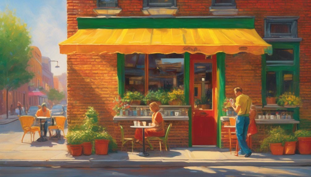
Urban Scenes Exploration
Urban scenes pulse with life, offering a dynamic color palette that reflects the energy of everyday experiences. The interplay of light and shadow on urban architecture creates captivating visuals, while the vibrancy of city landscapes invites exploration. You’ll find inspiration in bustling streets, with their mix of people, vehicles, and storefronts.
| Element | Color Inspiration | Scene Example |
|---|---|---|
| Urban Architecture | Warm bricks, cool glass | Skyscrapers at sunset |
| City Landscapes | Lively greens, soft blues | Parks in spring |
| Daily Life | Bright clothing, neon signs | Street festivals |
As you observe these elements, let them guide your choice of colors and shapes, infusing your artwork with the lively spirit of urban life.
Home Decor Inspiration
Everyday life offers countless sources of inspiration for home decor, transforming your living space into a canvas that reflects your personality and experiences.
Look around your home; the textures and colors of your favorite home accents can spark creativity. Maybe it’s the rich hue of your sofa or the vibrant patterns on your throw pillows that ignite your imagination.
Think about how you can achieve color balance by mixing warm and cool tones throughout your space. A well-placed piece of art or an eclectic collection can add depth and character.
Let your daily surroundings guide your choices, and don’t shy away from experimenting. Your home decor can be an evolving masterpiece that tells your unique story through every color and accent.
Frequently Asked Questions
How Can I Mix Colors Effectively at Home?
You can mix colors effectively at home by exploring color theory, using different mediums. Start with primary colors, experiment with ratios, and blend them to discover unique shades that enhance your projects and unleash creativity.
What Are Some Popular Color Combinations for Beginners?
You’ll love using complementary colors from the color wheel, like blue and orange or red and green. These combinations create vibrant contrasts, making your artwork pop and capturing viewers’ attention with striking visual harmony.
How Do I Choose a Color Palette for My Artwork?
Start by considering color theory; 90% of people make snap judgments based on color alone. Choose a palette that evokes the desired emotional impact, mixing hues that resonate with your artwork’s theme and message.
What Tools Can Help Me Visualize Color Schemes?
You can visualize color schemes using a color wheel and various digital tools. Apps like Adobe Color and Coolors help you experiment with combinations, enabling you to see how colors interact and inspire your artwork effectively.
How Does Lighting Affect Color Perception in Art?
Lighting dramatically alters color perception in art. Warmer light temperatures enhance reds and yellows, while cooler tones deepen blues and greens. Shadows shift colors, creating depth and drama, inviting you to explore the interplay of light and shadow.
Conclusion
In the vibrant world of color, inspiration is often just around the corner. As the saying goes, “variety is the spice of life,” and by embracing nature, art history, cultural influences, and even everyday moments, you can enrich your palette. Dive into the hues that move you, experiment with new combinations, and let your unique experiences shape your art. Remember, every stroke of color tells a story—make yours unforgettable.