Color theory might seem like a daunting subject, but it’s really just a helpful guide to understanding the dance of colors. As you explore the basics, you’ll uncover how colors can complement or clash, creating a visual impact. You’ll also discover how to use color to evoke emotions in your artwork. What techniques can you implement to elevate your pieces and engage your audience more deeply?
Key Takeaways
- Understand the color wheel to navigate relationships between primary, secondary, and tertiary colors for effective coloring choices.
- Use complementary colors for striking contrasts that enhance focal points in your artwork.
- Aim for color harmony to create cohesive designs that evoke specific emotions and set the desired tone.
- Experiment with various color schemes, such as monochromatic and analogous, to add depth and interest to your coloring projects.
- Consider the psychology of color, as different hues can influence emotions and perceptions in your artwork.
Understanding the Color Wheel

The color wheel is a fundamental tool in color theory that helps you visualize the relationships between different hues. When you look at it, you’ll see primary colors like red, blue, and yellow, which serve as the foundation for all other colors.
Mixing these colors leads to secondary hues like green, orange, and purple. You can also create a spectrum of tertiary colors by blending primary and secondary hues.

Understanding this wheel allows you to make informed choices when selecting colors for your projects. It can enhance your work by guiding you in creating harmony or contrast.
Exploring Complementary Colors
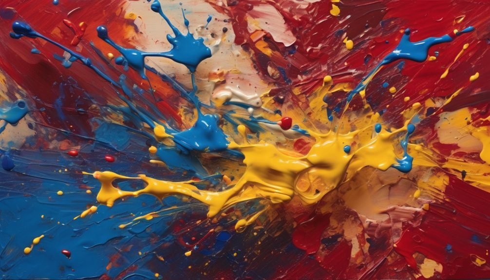
When you pair colors that sit opposite each other on the color wheel, you create striking contrasts that can make your designs pop. This pairing, known as complementary colors, brings energy and dynamism to your artwork.
For instance, combining a vibrant blue with a bold orange not only highlights each hue but also draws the viewer’s eye. You can use complementary colors to emphasize important elements in your work, making them stand out effectively.
Experimenting with these combinations can lead to exciting visual effects, whether you’re painting, designing, or crafting. Just remember, balance is key; too much contrast might overwhelm your audience.
The Importance of Color Harmony
While contrasting colors can grab attention, achieving color harmony is essential for creating a cohesive and pleasing design. When colors work well together, they evoke emotions and set the tone for your artwork. You’ll want to consider various color schemes to find the right balance.
Here’s a quick reference table to help you visualize some harmonious color combinations:
| Color Scheme | Description |
|---|---|
| Monochromatic | Variations of a single color |
| Analogous | Colors next to each other |
| Triadic | Three colors evenly spaced |
| Split-Complementary | One base color + two adjacent |
| Tetradic | Four colors forming a rectangle |
The Psychology of Color
Understanding color harmony naturally leads to exploring the psychology of color. Each hue influences emotions and perceptions, shaping how you experience your artwork.
For instance, warm colors like red and orange evoke energy and passion, while cool colors such as blue and green promote calmness and tranquility.
When you choose colors for your projects, consider how they make you and others feel. Bright colors can create excitement, while muted tones might evoke nostalgia or comfort.
Think about the message you want to communicate through your colors. By tapping into the psychological effects of color, you can enhance the emotional impact of your work and connect more deeply with your audience.
Tips for Applying Color Theory in Your Artwork
Applying color theory effectively can elevate your artwork and engage viewers more deeply. Start by selecting a color scheme that aligns with your theme—complementary, analogous, or monochromatic. Use the color wheel to find harmony and contrast, making your focal points pop.
Here’s a quick reference table to guide your choices:
| Color Scheme | Description |
|---|---|
| Complementary | Opposite colors for contrast |
| Analogous | Colors next to each other |
| Monochromatic | Variations of one color |
| Triadic | Three colors evenly spaced |
| Split-complement | One color and two adjacent |
Experimenting with these techniques will help you create mood and depth, ensuring your artwork resonates with your audience.
Frequently Asked Questions
What Materials Are Best for Practicing Color Theory?
To practice color theory, you’ll want good quality colored pencils, watercolors, or markers. Pair these with a sketchbook and color wheel. Experimenting with different materials helps you understand color relationships and improve your skills effectively.
How Can I Mix Colors Effectively?
To mix colors effectively, start with primary colors, add small amounts gradually, and test on paper. Use a palette to see how they blend, adjusting ratios until you achieve the desired hue or shade.
What Is the Difference Between Warm and Cool Colors?
Warm colors dance like a flickering flame, radiating energy and excitement, while cool colors flow like a calm breeze, invoking serenity. Essentially, warm colors energize, and cool colors soothe, creating different emotional atmospheres in your art.
Can Color Theory Apply to Digital Art?
Yes, color theory definitely applies to digital art. You can enhance your compositions, evoke emotions, and create depth by understanding color relationships. Experimenting with palettes will transform your artwork and make it more visually appealing.
How Do Cultural Differences Influence Color Perception?
Cultural differences shape how you perceive colors. For instance, while white symbolizes purity in some cultures, it represents mourning in others. Understanding these nuances can enhance your artwork and deepen its emotional resonance across diverse audiences.
Conclusion
By mastering color theory, you can transform your artwork into something truly captivating. Did you know that studies show 85% of consumers make purchasing decisions based on color? This highlights how powerful color can be in conveying emotions and messages. So, whether you’re using complementary colors or exploring harmony, remember that your choices can deeply resonate with your audience. Embrace these principles, and watch your creations come to life in ways you never thought possible!