Is it true that vintage coloring styles can reveal deeper insights into the societal values of their time? By examining the unique palettes and techniques from different eras, you might uncover how color choices reflect cultural sentiments and artistic advancements. This exploration not only highlights the aesthetic appeal but also invites you to consider how these historical influences can inform contemporary art practices. What can we learn from the past to enrich our present creations?
Key Takeaways
- Vintage coloring blends historical influences and technological advancements, creating unique palettes that convey emotions and cultural values.
- Soft, earthy hues and muted tones promote calmness, while bold accent colors add vibrancy, enhancing visual harmony in designs.
- Comic book palettes introduced dynamic contrasts and experimentation with color, influencing artistic styles and emotional narratives across mediums.
- Screen printing innovations expanded color application, enabling richer palettes and intricate designs that bridge past and present art practices.
- Incorporating vintage colors in modern art involves using retro palettes, blending techniques, and integrating nostalgic motifs for a cohesive aesthetic.
The Origins of Vintage Coloring Techniques

While many may see vintage coloring as a mere aesthetic choice today, its origins are steeped in history, reflecting the artistic movements and technological advancements of their time.
Vintage color palettes emerged from a blend of cultural influences, including the rich hues of the Renaissance and the pastel tones popularized during the Victorian era. Each era contributed unique shades that conveyed emotions and societal values.
As you explore these historical influences, you’ll discover how advancements in dye production and printing techniques allowed artists to experiment with color in ways previously unimaginable.
This interplay between art and technology laid the groundwork for what we now recognize as vintage coloring, giving it depth beyond mere appearance and connecting it to the broader narrative of art history.
Key Characteristics of Mid-Century Color Palettes
Mid-century color palettes are defined by a striking contrast between muted tones and bold accent colors.
You’ll notice how soft, earthy hues create a calming backdrop, while vibrant shades pop to draw attention and add visual interest.

This balance not only reflects the design sensibilities of the era but also shapes the overall mood of a space.
Muted Tones and Hues
As you explore mid-century design, you’ll quickly notice the signature appeal of muted tones and hues that define this era’s color palettes.
These soft palettes create a serene ambiance, steering clear of the jarring extremes found in contemporary styles. Earthy shades like olive green, burnt sienna, and mustard yellow dominate, evoking a connection to nature and a sense of groundedness.
This understated approach allows for versatility, letting furniture and décor take center stage without overwhelming the space. The muted tones also promote harmony, making rooms feel inviting and comfortable.
Bold Accent Colors
Bold accent colors serve as the vibrant punctuation in the otherwise subdued narratives of mid-century design.
These bold color palettes, often featuring hues like teal, mustard, and coral, create striking contrasts against muted backgrounds, drawing the eye and energizing the space. You can see how these colors carry vintage color symbolism, representing optimism and innovation during a transformative era.
In furniture, artwork, and textiles, these accents highlight individual pieces, making them focal points within a room. They evoke feelings of nostalgia while embracing a modern aesthetic, merging the past with contemporary sensibilities.
The Impact of Comic Books on Coloring Styles
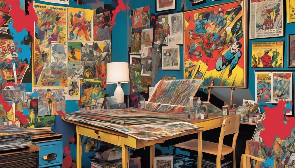
Though comic books may initially seem like simple entertainment, their influence on coloring styles has profoundly shaped visual art and design.
You can trace the evolution of color palettes in various mediums back to the vibrant hues and bold contrasts found in comic books. These works not only introduced striking color combinations but also defined emotional tones and narratives through color.
The vibrant hues and bold contrasts of comic books have profoundly shaped color palettes and emotional narratives across various artistic mediums.
As artists embraced comic book influences, they began experimenting with palettes that evoke nostalgia while retaining a contemporary edge. The use of flat colors and dynamic shading techniques originated in comics, encouraging a more expressive and accessible approach to visual storytelling.
Ultimately, the legacy of comic book coloring continues to inspire and challenge artists today, reflecting a rich interplay between nostalgia and innovation.
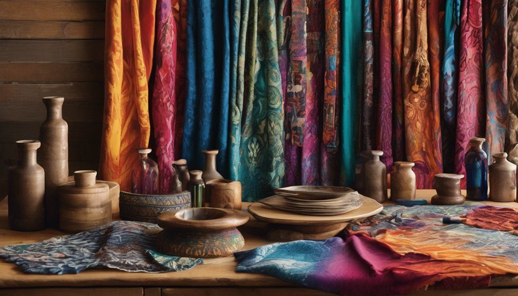
Watercolor Wonders: A Look at Vintage Illustrations
Vintage illustrations, particularly those created with watercolors, capture a unique charm that resonates deeply with viewers. You’ll notice how watercolor techniques breathe life into these artworks, blending soft washes with intricate details.
The use of vintage palettes, with their muted hues and earthy tones, adds to the nostalgic feel, evoking memories of simpler times. Each stroke tells a story, whether it’s the delicate petals of a flower or the whimsical characters in a tale.
These illustrations often reflect the artist’s mastery of light and shadow, inviting you to explore their depths. By examining these vintage watercolor works, you gain insight into the aesthetics and emotional resonance that have influenced generations of artists and continue to inspire today.
The Rise of Screen Printing and Its Color Innovations
As you explore the rise of screen printing, you’ll notice how this technique transformed color application in art.
Innovations like layering and the use of vibrant inks not only expanded creative possibilities but also shaped cultural trends.
Evolution of Screen Printing
While many artistic techniques have evolved over time, screen printing stands out for its significant impact on color application and design versatility.
You’ll find that early screen printing techniques relied heavily on stencils, which limited color options. However, as artists began to experiment with color layering, the medium transformed dramatically. This evolution allowed for richer palettes and more complex designs, enabling you to create stunning graphics that resonate with viewers.
By incorporating various inks and materials, screen printers expanded their horizons, pushing boundaries in art and fashion. The rise of digital technology further revolutionized screen printing, enhancing color accuracy and consistency.
Ultimately, this journey reflects a dynamic interplay between creativity and innovation in the world of color application.
Color Techniques and Trends
Though modern screen printing techniques have advanced significantly, the core principles of color application continue to draw from historical practices, reshaping how artists and designers approach their work.
You’ll notice that many contemporary designs harness the power of color symbolism, using hues to invoke emotions and communicate deeper meanings. Nostalgic palettes, reminiscent of bygone eras, have surged in popularity, allowing you to connect with the past while engaging with modern aesthetics.
Impact on Art Culture
The rise of screen printing has transformed art culture by enabling artists to experiment with color in unprecedented ways.
You’re witnessing a shift where color symbolism plays a crucial role, as bold hues evoke emotions and tell stories. Screen printing allows for layers of color, creating depth that traditional methods often lack.
This innovation taps into artistic nostalgia, drawing inspiration from vintage styles while simultaneously pushing boundaries. Artists like Andy Warhol embraced this technique, reviving pop culture icons with vibrant palettes.
As you explore this medium, you’ll find that screen printing not only enhances visual impact but also fosters a dialogue between past and present, making it a vital part of contemporary art culture that celebrates both innovation and tradition.
Exploring Pastel Colors in Retro Designs
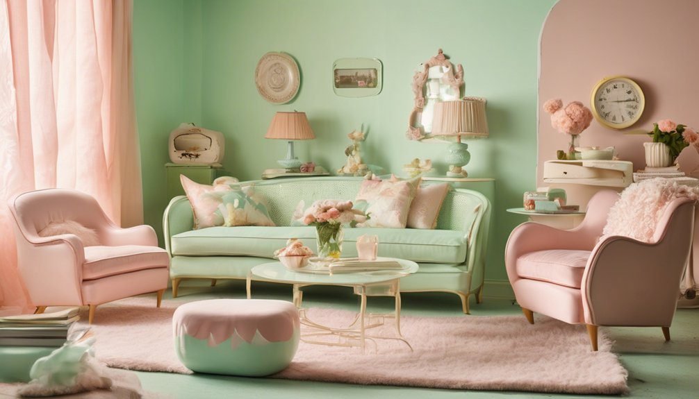
As you delve into the world of retro designs, pastel colors emerge as a defining characteristic, evoking nostalgia and warmth.
These soft hues, often found in pastel palettes, encapsulate the essence of mid-20th century aesthetics, creating a sense of familiarity and comfort.
Think of mint greens, buttery yellows, and blush pinks that breathe life into vintage graphics and textiles.
The interplay of these colors not only enhances visual appeal but also reinforces retro aesthetics, making designs feel timeless.
By incorporating pastel shades, you can evoke specific emotions and memories, drawing viewers in.
Whether it’s in fashion, interior design, or graphic art, embracing pastels can transport you to a simpler, more cheerful era, enriching your creative projects with historical significance.
The Role of Color Theory in Vintage Art
Color theory plays a pivotal role in shaping the emotional resonance and visual harmony of vintage art. When you explore vintage palettes, you’ll notice how these color combinations evoke nostalgia and warmth.
Artists often relied on color harmony to create balanced compositions, drawing your eye to focal points while maintaining a cohesive feel. For instance, muted earth tones and soft pastels can evoke a sense of calm, while bold primary colors might stir excitement.
Understanding the psychological impact of colors allows you to appreciate why certain hues were favored in specific eras. By analyzing these choices, you can gain deeper insights into the cultural contexts of vintage art, enriching your experience as you engage with these timeless creations.
How to Incorporate Vintage Coloring Into Modern Art

Vintage coloring can breathe new life into modern art, creating a compelling dialogue between past and present.
To incorporate vintage elements, start by experimenting with retro palettes, choosing muted colors that evoke nostalgia. Think soft pastels or earthy tones reminiscent of bygone eras.
Emphasize color blending techniques to achieve a smooth transition between shades, reminiscent of vintage prints. This technique not only adds depth but also bridges the gap between modern sensibilities and historical aesthetics.
Consider layering colors to replicate the texture of vintage artworks, creating a tactile experience.
Finally, don’t shy away from incorporating patterns or motifs from vintage designs, allowing them to enhance the narrative of your artwork while maintaining a contemporary twist.
Frequently Asked Questions
What Tools Were Commonly Used for Vintage Coloring Techniques?
You’d typically use a limited color palette with coloring mediums like watercolors, colored pencils, and inks. These tools create depth, texture, and vibrancy, enhancing the nostalgic feel of vintage coloring techniques that evoke a sense of history.
How Have Vintage Coloring Styles Influenced Modern Design Trends?
Vintage coloring styles breathe life into modern design, infusing it with retro palettes and nostalgic aesthetics. You’ll notice how these influences create warm, inviting spaces that evoke cherished memories, making designs feel timeless and relatable.
Are There Specific Vintage Coloring Styles for Different Art Forms?
Yes, specific vintage coloring styles exist for various art forms. Each artistic movement showcases distinct color palettes, like Art Deco’s bold hues or Impressionism’s soft pastels, influencing contemporary aesthetics and enriching visual storytelling across mediums.
What Are the Best Resources for Learning Vintage Coloring Methods?
You’ll want to dive into books on color theory, vintage art journals, and online tutorials. Historical techniques reveal secrets; they’ll turn your palette into a time machine. Just don’t expect to paint like a Renaissance master overnight!
Can Vintage Coloring Styles Be Applied Digitally?
Yes, you can apply vintage coloring styles digitally. By using digital techniques, you can mimic classic textures and palettes, achieving vintage aesthetics that resonate with traditional methods while benefiting from modern tools and flexibility.
Conclusion
Incorporating vintage coloring styles into modern art lets you blend nostalgia with contemporary creativity. As the saying goes, “You can’t paint the town red without a little gray.” By understanding the emotional depth and cultural significance of past palettes, you can create works that resonate on multiple levels. Embrace these historic techniques, and you’ll not only honor the artistry of the past but also enrich your own artistic expression, bridging the gap between eras with vibrant hues.