Coloring botanical and floral pages can be both a calming experience and a creative challenge. You want your artwork to pop, yet remain true to nature. By choosing the right tools and understanding color theory, you can achieve stunning results. But knowing where to start can feel overwhelming. So, how do you transform your pages into vibrant displays of color? Let’s explore the essential techniques that can elevate your coloring game.
Key Takeaways
- Choose high-quality colored pencils or markers for smooth application and vibrant colors in your botanical and floral pages.
- Understand color theory to effectively use complementary, analogous, and warm/cool tones for emotional impact in your artwork.
- Experiment with blending techniques using circular motions and blending tools to achieve seamless color transitions.
- Layer colors gradually, starting with a light base and building up darker shades for depth and dimension in your illustrations.
- Incorporate texture using stippling, cross-hatching, and various tools to enhance the lifelike quality of your botanical and floral designs.
Choosing the Right Coloring Tools
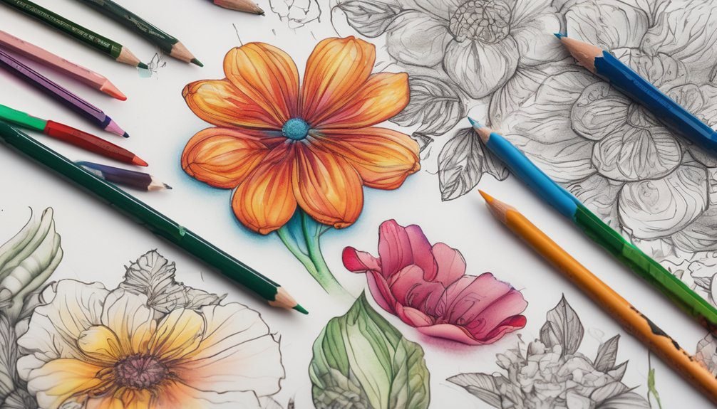
When it comes to coloring botanical pages, the right tools can make all the difference. You’ll want to select high-quality colored pencils or markers that glide smoothly across the paper.
Colored pencils offer versatility, allowing you to blend and layer colors effectively. If you prefer markers, choose ones that won’t bleed through the paper. Watercolor pencils can also be fun; they let you create soft washes of color with a brush and water.
Don’t forget to grab a good eraser for any mistakes, and consider using a sharpener to keep your pencils fine-tipped.
Lastly, a comfortable workspace with good lighting can enhance your coloring experience, helping you enjoy every moment of this creative pursuit.
Understanding Color Theory
Understanding color theory is essential for bringing your botanical pages to life, as it helps you choose harmonious color combinations that enhance your artwork.

Familiarize yourself with the color wheel, which shows primary, secondary, and tertiary colors. You’ll want to learn about complementary colors, which are opposite each other on the wheel, and create striking contrasts.
Analogous colors, found next to each other, can produce a more serene look. Pay attention to warm and cool tones; warm colors can evoke energy, while cool colors offer calmness.
Experimenting with saturation and brightness will also add depth to your pages. By grasping these concepts, you can create visually appealing compositions that truly capture the beauty of nature.
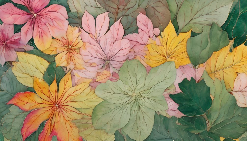
Selecting a Color Palette
As you embark on selecting a color palette for your botanical pages, consider the mood you want to convey and the emotions you wish to evoke. Think about whether you want a vibrant, cheerful look or a calm, serene vibe.
You might choose warm colors like reds and yellows for energy or cool tones like blues and greens for tranquility.
Look at nature for inspiration; observe how colors coexist in flowers and leaves. Don’t be afraid to mix complementary colors to create depth.
Using a limited palette can also help maintain harmony in your artwork. Finally, test your chosen colors on a scrap piece before applying them to your final work, ensuring they reflect your vision perfectly.
Techniques for Blending Colors
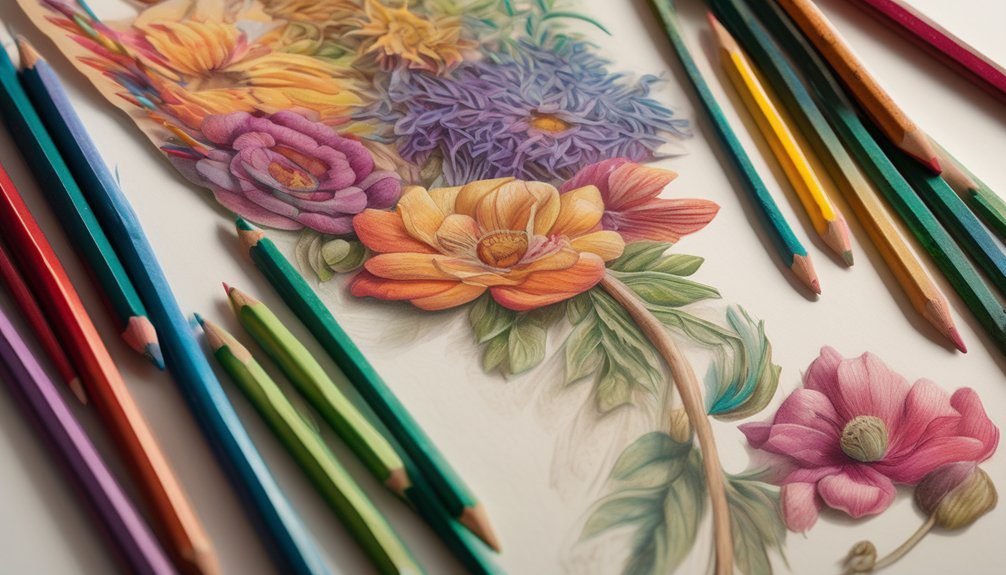
Although blending colors can seem daunting, it’s a crucial skill that can elevate your botanical art. To start, choose two or three colors that complement each other. Use a smooth, circular motion with your colored pencils or markers, gradually layering the lighter color first, then adding the darker shade. This method allows the colors to mix naturally.
Another technique is using a blending stump or a cotton swab for pencils; just lightly rub over the area to soften the lines. For markers, try using a colorless blender to merge shades seamlessly.
Lastly, don’t hesitate to experiment! Practice different combinations and strokes to discover what works best for your style. Happy blending!
Layering Colors for Depth
When you layer colors effectively, you create depth and dimension in your botanical art. Start with a light base color, applying it evenly across the area.
Once that’s dry, choose a slightly darker hue and apply it in areas where shadows naturally occur. This contrast brings your artwork to life.
Don’t hesitate to go back and add more layers; just ensure each layer is dry before adding the next. You can use a blending tool or your finger to soften the edges between colors, enhancing the depth.
Remember to observe real plants closely; notice how light affects their colors. By practicing these techniques, you’ll develop a richer, more dynamic representation of botanical elements in your coloring pages.
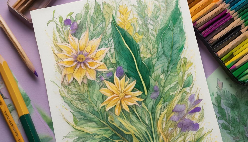
Adding Texture to Your Artwork
Texture can elevate your botanical artwork, making it more engaging and lifelike. To achieve this, consider using various techniques to create dimension.
You might try stippling, where you apply small dots of color to mimic the delicate details of petals or leaves. Alternatively, cross-hatching can add depth and contour, especially for darker areas.
Don’t shy away from experimenting with different tools; sponges, brushes, or even your fingers can produce unique textures. Another approach is layering colors in varying thicknesses, giving the illusion of rough or smooth surfaces.
Using Highlights and Shadows
Adding highlights and shadows can significantly enhance the depth of your botanical pages.
Start by observing where the light hits your flowers and leaves. Use a lighter shade to create highlights on areas that catch the light, like the tips of petals.
Next, choose a darker shade for shadows. Think about where the light is blocked, such as the undersides of leaves or the base of petals.
Blend these colors gently to create a smooth transition, adding realism to your artwork. Don’t be afraid to experiment with intensity; sometimes, subtle highlights and shadows can make a big difference.
Experimenting With Different Mediums
While exploring different mediums can seem daunting, it’s a fantastic way to find your unique style in coloring botanical pages.
Start with colored pencils for their precision and ease of blending. Then, try watercolors for a softer, more fluid look. You might be surprised at how vibrant they can make your flowers pop!
Markers offer bold colors and can be layered for depth, while gel pens add a fun metallic or glittery touch.
Don’t shy away from experimenting with pastels, as they deliver a dreamy effect. Each medium has its own charm, so mix and match until you discover what resonates with you.
Staying Within the Lines: Tips for Precision
To achieve precision in your botanical coloring, it’s essential to focus on control and technique. Start by holding your coloring tool lightly, allowing for better maneuverability. Use the tip of your pencil or marker to trace the edges of the lines gently. This helps you stay within bounds while creating a clean finish.
If you’re using markers, consider a fine-tipped option for detailed areas. For larger sections, apply lighter pressure to avoid overspilling. Practice short, controlled strokes instead of long, sweeping motions.
If you accidentally color outside the lines, don’t stress—just use a colorless blender or a white gel pen to correct minor mistakes. With patience and practice, you’ll master the art of staying within the lines!
Showcasing Your Finished Artwork
Once you’ve completed your botanical coloring masterpiece, showcasing it becomes the next exciting step. You’ve invested time and creativity, so let your artwork shine!
Consider framing your piece to give it a polished look; choose a frame that complements your colors. Alternatively, you can create a gallery wall with a series of your favorite pieces, adding a personal touch to your space.
If you’re feeling social, share your artwork on social media or in online art communities. Post high-quality images and engage with fellow artists for feedback and encouragement.
Lastly, don’t forget to keep a scrapbook or portfolio of your works; it’s a great way to track your progress and celebrate your creativity. Enjoy your beautiful creations!
Frequently Asked Questions
What Types of Paper Work Best for Coloring Botanical Pages?
For coloring botanical pages, use thick, smooth paper like cardstock or watercolor paper. These types prevent bleed-through and allow vibrant colors to pop. You’ll enjoy better results with quality paper that supports your coloring tools.
How Can I Prevent My Markers From Bleeding Through Pages?
To prevent your markers from bleeding through pages, use thicker paper or place a protective sheet underneath. You can also try water-based markers, as they tend to bleed less than alcohol-based options. Happy coloring!
Are There Specific Color Schemes for Different Seasons?
Yes, you can use specific color schemes for different seasons. In spring, opt for pastels; summer’s vibrant hues; autumn’s warm oranges and browns; and winter’s cool blues and whites create a beautiful seasonal palette.
Can I Use Watercolor on Printed Coloring Pages?
Yes, you can use watercolor on printed coloring pages! In fact, over 60% of coloring enthusiasts prefer watercolors for their vibrant effects. Just make sure your paper is thick enough to handle the moisture.
How Do I Clean My Coloring Tools After Use?
You can clean your coloring tools by rinsing brushes with water, wiping pencils with a damp cloth, and using soap for markers. Ensure everything’s dry before storing to keep your tools in great condition.
Conclusion
You might think that coloring is just for kids, but it’s a wonderful way to relax and express your creativity, no matter your age. Embrace the process and remember that every stroke adds personality to your artwork. Don’t worry about perfection; focus on enjoying the colors and techniques. With practice, you’ll create stunning botanical and floral pages that reflect your unique style. So grab those colored pencils, and let your imagination blossom!