When it comes to enhancing your pages, think of shading as your secret ingredient. It can elevate your visuals without overwhelming them. By mastering a few key techniques, you can create depth and interest that draws the eye. From selecting the right colors to employing gradients, there’s a lot to explore. So, how do you ensure your shading truly makes an impact? Let’s uncover some effective strategies together.
Key Takeaways
- Use a defined color palette with contrasting light and dark shades to create visual interest and depth on the page.
- Incorporate gradients, both linear and radial, to enhance dimension and draw attention to focal points in your design.
- Experiment with layering shadows using multiple colors and varying opacity for more complex and realistic shadow effects.
- Maintain consistency in shading techniques and light sources throughout the design for a cohesive and polished look.
- Add texture to shadows and highlights to create a more dynamic and engaging visual experience on your pages.
Understanding the Basics of Shading
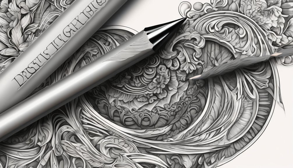
Shading is a crucial element in creating depth and dimension in your artwork. It helps define shapes and brings a three-dimensional quality to your pieces.
Start by identifying your light source; this will guide where shadows and highlights should fall. Use a range of pressure on your pencil or brush to achieve different levels of darkness. Light pressure creates soft shadows, while heavy pressure produces bold, dark areas.
Identifying your light source is essential for accurate shadows and highlights, while varying pressure creates depth in your artwork.
Experiment with techniques like cross-hatching or blending to find what suits your style best. Remember to practice consistency in your shading; uneven shadows can detract from the overall effect.

As you develop your skills, you’ll see how mastering shading transforms your work, making it more dynamic and engaging for your audience.
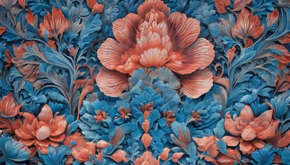
Choosing the Right Colors for Depth
While mastering shading techniques is important, choosing the right colors can significantly enhance the depth of your artwork. Start by selecting a color palette that includes both light and dark shades of your main colors. This contrast creates a more dynamic visual experience.
Here’s a simple color guide to help you choose the right shades:
| Light Shades | Dark Shades |
|---|---|
| Soft Yellow | Deep Gold |
| Sky Blue | Navy Blue |
| Pale Pink | Rich Magenta |
| Mint Green | Forest Green |
| Light Gray | Charcoal Gray |
Incorporate these combinations into your shading process, and you’ll notice an immediate improvement in the three-dimensional feel of your artwork. Happy creating!
Techniques for Layering Shadows
Once you’ve selected your color palette, the next step is mastering techniques for layering shadows.
Layering shadows adds depth and dimension, making your designs more dynamic. Here are some techniques to help you achieve that:
- Use multiple shadow colors: Combine different shades for more complexity.
- Vary opacity levels: Adjust the transparency to create a gradual shadow effect.
- Experiment with blur: Softer edges can make shadows feel more natural.
- Adjust shadow angles: Shift the direction of your light source to change the shadow’s appearance.
- Incorporate texture: Adding texture to your shadows can create a more realistic look.
Utilizing Gradients for Dimension
To create a sense of depth and dimension in your designs, utilizing gradients can be a game changer. Gradients add visual interest and help elements stand out by transitioning between colors smoothly.
Start by selecting a color palette that complements your design. Use a linear gradient for a sleek, modern look, or opt for a radial gradient to draw attention to a focal point. Adjust the angle and intensity to create a more dynamic effect.
You can also layer gradients over images or shapes to enhance depth. Remember, subtlety is key; too harsh transitions can distract from your main content.
Incorporating Textures to Enhance Visuals
Incorporating textures can significantly enhance the visual appeal of your designs, making them more engaging and tactile. By adding texture, you create depth and interest, inviting viewers to explore your work further.
Here are some ways to effectively incorporate textures:
- Paper textures: Use realistic backgrounds to mimic natural materials.
- Fabric elements: Add cloth-like textures for warmth and familiarity.
- Natural patterns: Integrate wood, stone, or earth textures to evoke organic feelings.
- Digital brushes: Experiment with brush tools to create unique, hand-drawn effects.
- Layering techniques: Combine multiple textures for a richer, more complex look.
These techniques will help you elevate your designs, making them visually striking and memorable.
Don’t hesitate to experiment!
Tips for Consistency in Shading Styles
Achieving consistency in shading styles can greatly enhance the overall cohesion of your design. Start by establishing a defined color palette that you’ll use throughout your project. This helps create a unified look and feel.
Next, choose a specific shading technique—like cross-hatching, stippling, or gradients—and stick with it. Consistency in technique reinforces your design’s visual language.
Additionally, pay attention to light sources; ensure they remain consistent across elements for realistic shading. Keep track of your opacity levels, too—use the same levels for shadows and highlights to maintain harmony.
Finally, regularly step back to evaluate your work. This allows you to spot discrepancies and make adjustments as needed, ensuring a polished and cohesive final design.
Frequently Asked Questions
What Tools Are Best for Creating Shading Effects?
You’ll find that using blending stumps, soft pastels, and charcoal pencils creates stunning shading effects. Experiment with digital tools like Procreate or Photoshop, too—they offer versatile brushes and layers for achieving depth and realism in your work.
How Do I Fix Mistakes in Shading?
You can fix mistakes in shading by blending the area with a lighter shade, using an eraser for highlights, or layering darker tones carefully. Remember, every artist makes mistakes; it’s part of the process!
Can Shading Be Used in Digital Art?
Yes, you can definitely use shading in digital art! It enhances depth and dimension, making your artwork more dynamic. Experiment with various brushes and opacity levels to find the perfect effect that suits your style.
What Common Errors Should I Avoid When Shading?
Avoid common errors like over-blending your shades, neglecting light sources, and using inconsistent values. Keep your shadows smooth, your highlights sharp, and your overall balance even to create a more dynamic and engaging artwork.
How Do I Practice Shading Skills Effectively?
To practice shading skills effectively, start with simple shapes. Experiment with different pressure levels and tools. Analyze light sources in your references, and gradually progress to more complex subjects. Consistent practice will enhance your shading technique.
Conclusion
By mastering these shading tricks, you’ll breathe life into your pages, transforming them from flat to fabulous. Remember, your light source is the guiding star in your creative journey, and with the right colors and techniques, you can create a stunning visual symphony. Keep experimenting, stay consistent, and watch as your work begins to pop like fireworks on a summer night, captivating anyone who lays eyes on it. Embrace the art of shading, and let your creativity shine!